Back to all case studies

Case study

CodeHerWay Education Platform

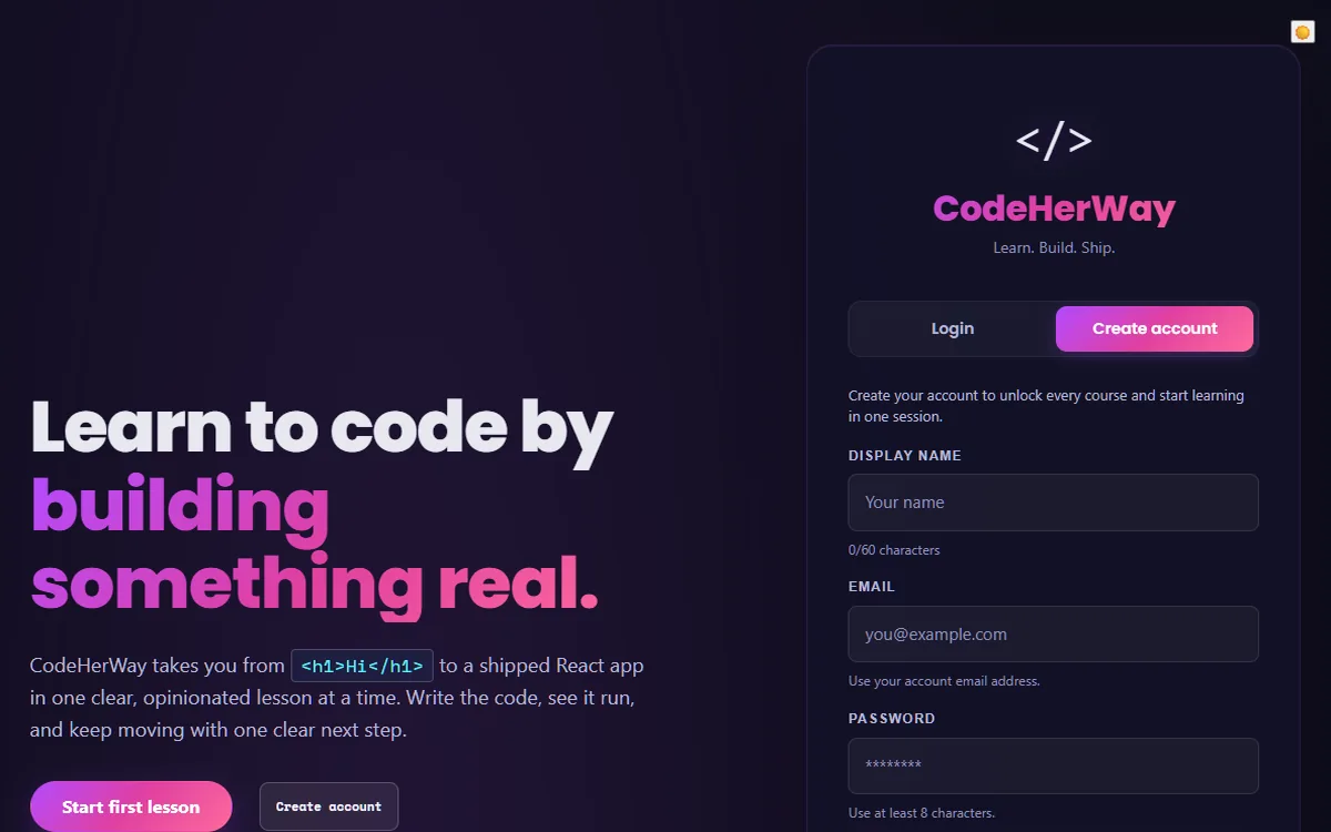
A frontend-focused learning platform for women entering tech, built around structured lessons, quizzes, visible progress, and a calm beginner experience. The project is strongest as a product-minded education platform with real auth, data, and quality-gate concerns in scope.

  • React + Supabase product work
  • Accessible learning UI
  • Documented QA notes
Project type
Learning platform and portfolio product
Stack
React, Vite, Supabase, JavaScript, CSS
Proof points
Auth, progress persistence, quizzes, rewards, accessible UI, async states, and documented QA notes.
Last verified
with static page, asset, landmark, and console smoke checks.
CodeHerWay Education Platform landing and account creation interface
Captured from the public live demo on May 12, 2026.

Learning product lens

The core challenge was keeping beginners moving without overwhelming them.

CodeHerWay needed to feel structured, encouraging, and honest. I designed the interface around guided lessons, visible progress, quiz feedback, and XP / streak logic so learners could understand what to do next and feel momentum without confusing completion with mastery.

Guided learning

Lessons are organized around a clear next step instead of dumping content at once.

Feedback loops

Quiz feedback helps learners understand mistakes immediately.

Motivation system

XP and streaks reward consistency while keeping mastery claims honest.

Evidence Snapshot

Learner flow built

  • Guided lessons
  • Quiz feedback
  • Persisted progress
  • XP / streak logic
  • Supabase-backed learner data

What was hard

  • Balancing beginner-friendly UX with real product logic
  • Making progress and reward feedback feel motivating without overwhelming the learner
  • Keeping UI states understandable across loading, feedback, saved progress, and incomplete flows
  • Connecting product behavior to clear frontend state instead of static page content

Key decisions

  • Used guided flows instead of dumping all content at once
  • Added visible progress so learners understand where they are
  • Used quiz feedback to reinforce learning immediately
  • Added XP / streak logic to reward consistency
  • Kept the interface calm and readable for beginners

What changed because of those decisions

  • The project became more like a real learning product than a static tutorial site
  • The UI communicates progress, feedback, and motivation
  • The case study shows product thinking, not only visual execution
  • The frontend work demonstrates state-driven product behavior

What to verify in 90 seconds

  • Open the live demo
  • Start or review a lesson flow
  • Trigger quiz feedback
  • Check progress or reward behavior
  • Inspect responsive layout
  • Review the GitHub repo structure
  • Read the case study decision notes

Current proof available

  • Live demo
  • GitHub repo
  • Case study
  • QA notes
  • Last verified date
  • Feature ownership summary

Proof still needed

  • Needs capture: Lighthouse report screenshot
  • Needs capture: axe accessibility scan screenshot
  • Needs capture: Responsive screen captures
  • Needs capture: Key user-flow screenshots
  • Needs capture: Repo structure screenshot
  • Planned evidence: Short interaction clip or GIF of lesson to quiz to feedback to progress

Learning Friction

Beginners can lose momentum when learning resources are scattered, next steps are unclear, or progress feels invisible. The product needed to feel supportive without hiding the technical rigor of learning HTML, CSS, JavaScript, and React.

Still to validate: real learner retention, completion friction, and where beginners most often need intervention should be measured before making outcome claims.

Users

  • Women entering tech who need a structured, beginner-friendly path.
  • Self-directed learners who benefit from visible progress, review, and consistency cues.
  • Technical reviewers evaluating whether the project behaves like a real product rather than a static demo.

Learner Experience Goals

  • Make the first learning path clear and guided.
  • Keep lesson, quiz, bookmark, and progress states understandable.
  • Use reward mechanics to support consistency without overstating mastery.
  • Keep the product reviewable through quality gates and documented limitations.

My Role

I own the product end to end: frontend architecture, learning and quiz UI, progress tracking, the XP and streak reward engine, Supabase authentication/data integration, and the portfolio documentation around product quality and current limits.

Beginner Momentum Decisions

  • Guided course flow with visible navigation so learners know where they are and what comes next.
  • Immediate quiz feedback and review surfaces that help learners understand mistakes without harsh tone.
  • Progress and reward language that separates motivational completion from verified mastery.
  • Honest sync and recovery copy when persistence depends on browser-local state or backend validation.

Learning Platform Engineering

  • React and Vite support a modular lesson platform while preserving fast local iteration.
  • Supabase provides an authentication and database path for real user progress instead of hardcoded demo state.
  • Learning, reward, route, and sync behaviors are covered by focused tests so reliability work is visible to reviewers.
  • Server-mediated workflows stay behind Netlify functions rather than exposing sensitive keys in the browser.

Motivation Tradeoffs

  • Constraint

    Beginner motivation needs to feel encouraging without implying verified mastery.

  • Decision

    XP and streaks reward consistency, while quiz review remains the place for learning feedback.

  • Tradeoff

    The reward loop supports momentum, but retention and completion impact still need real learner validation.

Accessibility Considerations

  • Keyboard navigation and focus handling are treated as product behavior, especially in lessons, dialogs, and panels.
  • Quiz and progress interactions use clearer semantic relationships and user-facing status copy.
  • Feedback states are kept purposeful so the interface supports learning rather than distracting from it.

Performance Considerations

  • The project uses explicit local and CI checks to keep regressions visible.
  • Route and lesson surfaces are structured so future performance work can target specific product areas instead of a single global bundle.
  • Next iteration includes deeper Lighthouse reporting and continued CSS modularization to reduce global surface area.

QA Notes

  • Measured on May 12, 2026: the PR-branch static smoke test returned HTTP 200 for this page on desktop and mobile, with no console/page errors and no completed broken images.
  • Accessibility smoke check: one H1, skip link, main landmark, and labelled navigation were present in both tested viewports.
  • Evidence standard: accessibility and performance content is framed as considerations and next work, not as unmeasured outcome claims.
  • Still to validate: authenticated learner flows against a configured staging backend and fresh Lighthouse reporting.

Current Status

CodeHerWay is an active portfolio product and learning-platform build. It demonstrates real product architecture and quality practices, but it should be presented honestly as a stabilized project still moving toward production readiness.

What I Learned

The strongest education-product evidence comes from connecting the learner-facing interface to real state rules: auth, progress, quiz review, and recovery paths. The next level is validating which of those choices actually helps beginners continue.

What I Would Improve Next

  • Validate authenticated learner flows against a configured staging backend.
  • Add stronger Lighthouse reporting and performance budgets.
  • Refine onboarding analytics around drop-off and lesson completion friction.
  • Continue reducing global CSS and clarifying shared UI primitives.